By Adam Pagnucco.
A couple days ago, we received a mailer from Council At-Large candidate Hoan Dang. We like Dang very much and might vote for him. But we hate this mailer for three reasons.
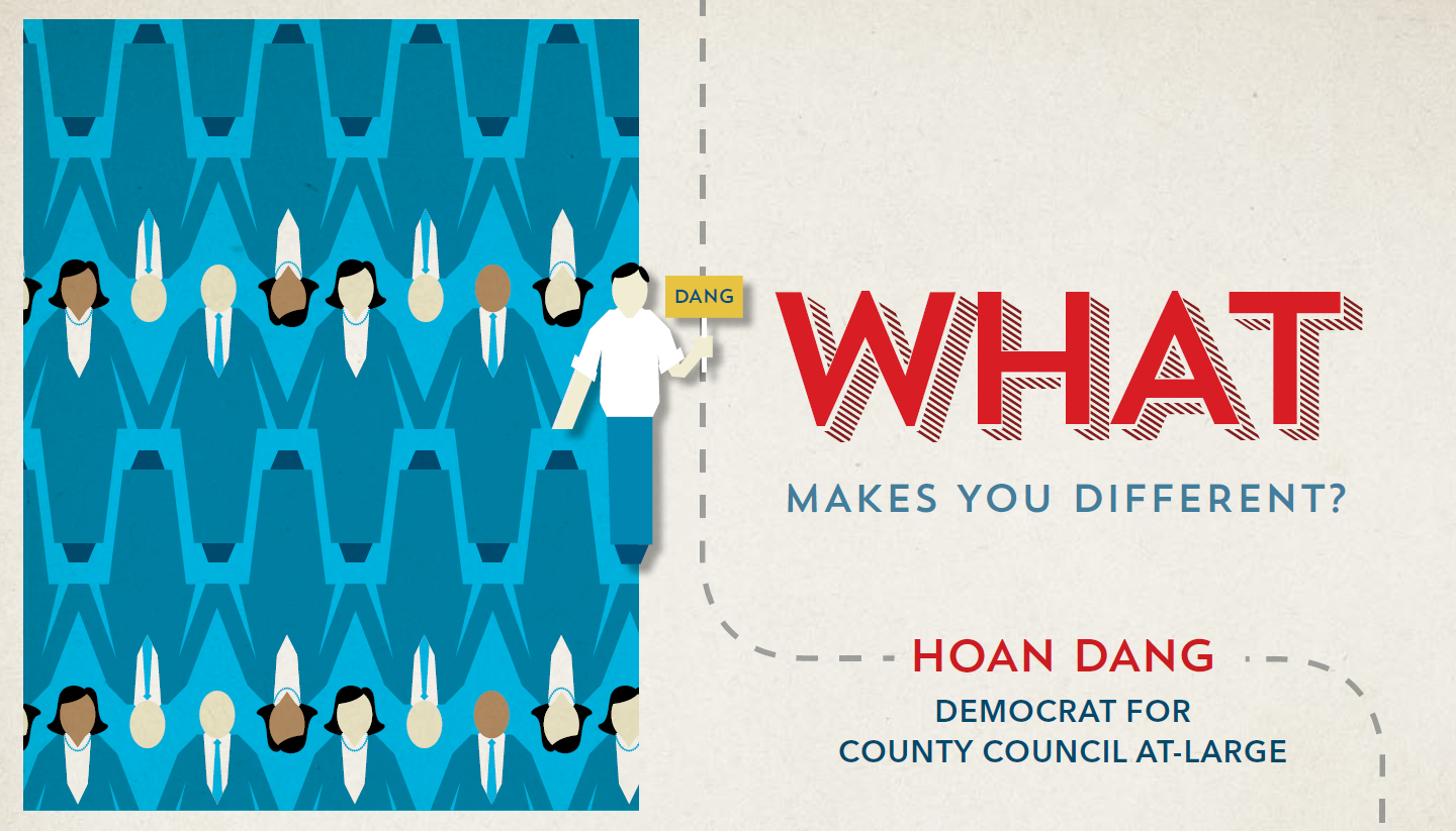
First, the cover doesn’t spotlight the candidate’s name or image. The key function of any mailer is to fix the candidate’s name in the mind of the recipient and couple it with a relatable image. In the case of a positive mailer like this one, a good image would be the candidate, perhaps with family members and a diverse group of supporters. This cover doesn’t do that. Its biggest word is “What,” which could mean anything. The candidate’s name is in relatively small print and his picture doesn’t appear.
Next, the mailer does not open easily to the interior content. It was secured by thick tape, preventing your author from opening it without either a) taking a certain amount of time to do it carefully or b) ripping or otherwise destroying the mailer. Dear mail firm guy: if you make it hard to open the mailer, most folks won’t open it. You have just wasted the candidate’s money. All tape of this kind should just be banned. Aside from the difficulty of opening it, we don’t have an issue with the interior other than the word “What” is waaaay bigger than the much more important words “Hoan Dang.”
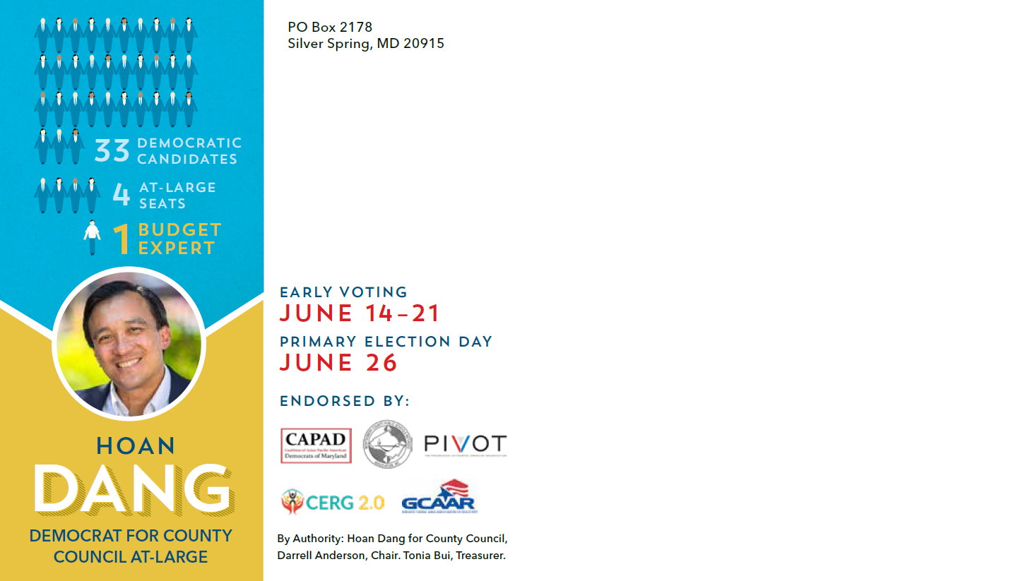
Finally, check out the large amount of empty space on the back. It’s not obvious from our image, but the empty space goes all the way to the right side of this page and accounts for a majority of the back cover. Dang is a handsome fellow with a pleasant smile. You want to have a large shot of that smiling face, not a tiny one. All the empty space shows that there was plenty of room to print that.
We are not criticizing Hoan Dang. He’s a good candidate and a great guy. But this mailer does not do him justice. He deserves better than this! If there’s any opportunity to do so, he should get another mail firm.


